About categories
Categories are a way to organise and group similar transactions, helping you gain a clearer understanding of where your money is coming from and going to. We categorise your expenses and income so you can identify patterns, track spending habits, and evaluate which areas of your financial life need attention or improvement.
👓 Love nerding out on technical details? Read more below.
Categories are shown in colour-coded tabs. The colours match those in the chart on your dashboard.
Tap a tab to switch categories.
Scroll left and right to access all categories.
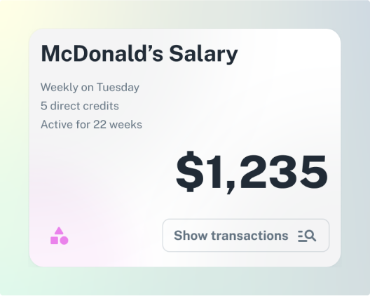
Each card represents a group of transactions. Card headings come from the bank transactions but sometimes transactions with different names are grouped together as they don’t make sense to show on their own. When this happens, the card will display ‘Other’ and the category name - e.g. Other Wages.
Tap a card to see how often the transactions occur and the type of transactions.
The figure on the card is a calculated weekly amount based on your historical transaction data and any behavioural trends we find in the transaction group. It doesn’t necessarily represent the average or the amount of your last transaction - instead, we do some complex analysis to calculate the weekly amount that’s likely to continue if your transaction behaviour continues as it has recently.
Click Show transactions to see the individual transactions that make up the group.
Sometimes there aren’t enough transactions in a group to confidently calculate a weekly amount. Imagine you went to your local pub only once as a treat - how would you come up with a weekly figure for something that only happened that one time?
When this happens, the total is normalised to an approximate weekly amount. The approximate amount is used when calculating category totals.


